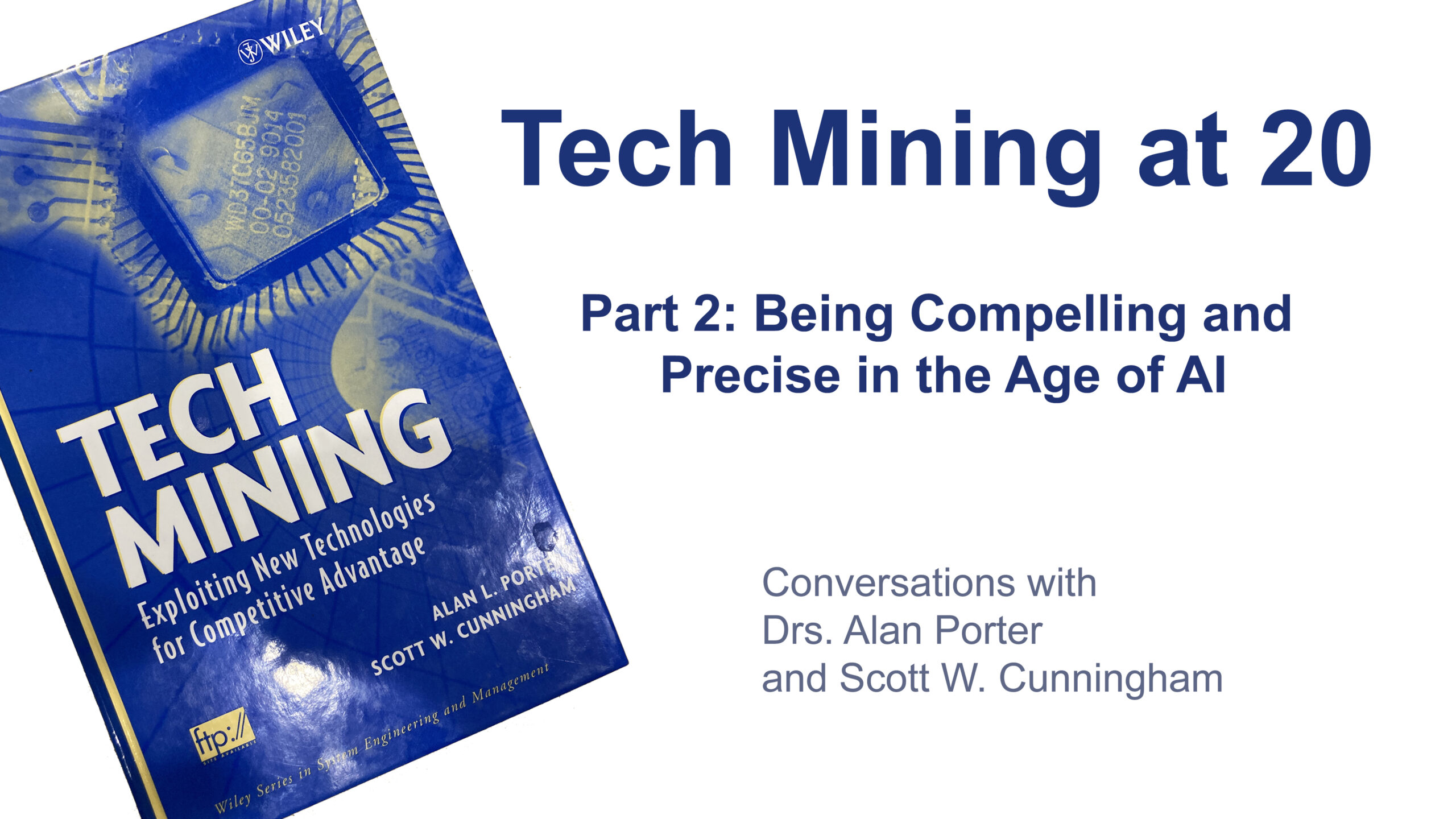
In a recent retrospective, Search Technology’s Nils Newman sat down with Alan Porter and Dr. Scott Cunningham, the authors of the seminal 2005 text Tech Mining: Exploiting New Technologies for Competitive Intelligence.
In part one, we explored rethinking R&D and the Tech Mining Adoption Gap. Be sure to watch the video if you missed it.
In part two of this series, the conversation shifted to a fundamental tension in the tech mining field. How do we start with the right data and end with a message that actually moves a boardroom? Be sure to watch the video for a deeper dive, but here are a few key highlights.
The Visual Paradox: Dashboards vs. “Drama”
Nils revisited the book’s early foray into innovation indicators, or what we would today call a “dashboard.” While the technology to create visuals has exploded since 2005, the authors argue that the human element of interpretation remains as messy as ever.
Alan emphasized that a “one-pager” is essential for engaging busy executives, but it should never be mistaken for a final answer. He views high-level visuals as a “quick instigation of issues you need to be thinking about,” rather than a shortcut to a decision.
Scott shared a humbling lesson from the corporate boardroom. Despite the sophistication of data maps, he found many executives weren’t actually “reading” the data.
“Everyone’s just watching my lips,” Scott recalled. “I’m interpreting out loud the pictures for them, and they’re really just a reminder… because my users don’t understand them at all.”
This led to a pivot in his philosophy: the need for “drama.”
A former interviewee at a pharmaceutical company once asked Scott, “Where is the drama in what you do?” Scott now recognizes this wasn’t a request for theater, but for narrative urgency.
So, Scott suggests that modern tech mining has split into two distinct visual practices:
The first are Personal Visualizations, which are highly complex tools for analysts to explore massive datasets and find patterns.
The second addresses the need for narrative urgency. Storytelling Visualizations are “Vivid pictures” (akin to those found in The Economist) designed to communicate a punchy, actionable narrative in less than a page.
From Librarians to LLMs
If the “end” of tech mining is the visual narrative, the “beginning” is the data source. Nils pointed out that the landscape has shifted from curated, librarian-managed professional databases to a “commodity” landscape flooded with “machine-generated slop.”
Alan warned against “disbanding the support entities,” meaning the librarians and professional searchers who act as gatekeepers of quality. While he acknowledges that Large Language Models (LLMs) can really enrich storytelling and make intelligence more digestible, the underlying data quality is under threat.
Scott expanded on this, describing LLMs as a “lossy compression of the internet.” This compression creates a feedback loop in which AI-generated content is being published back into scientific journals.
“That noise is creeping back into science,” Scott noted, citing reports that some leading journals now contain up to 5% AI-generated content. “This stuff is being written back, being put back in, and it’s also being trained [on].”
Scott argued that scientific terminology is so specialized that it isn’t “actual real human language.” Because of this, general AI models often struggle to grasp the nuance of innovation.
The authors look toward a future of “invention engines” or “scientific docents,” which are specialized AI models trained exclusively on high-fidelity scientific data, to filter the noise and help analysts reclaim the precision that defined the original “Tech Mining” vision.
Next up in Tech Mining at 20, part three … Why “Getting the Question Right” Still Matters in the Age of AI?